⬤ Description
Barista Boy short (B`BOY) is inspired by the rich traditions of coffee culture from around the world,
their menu boasts an extensive range of handcrafted beverages. Whether you crave a classic espresso, a cold brew coffee,
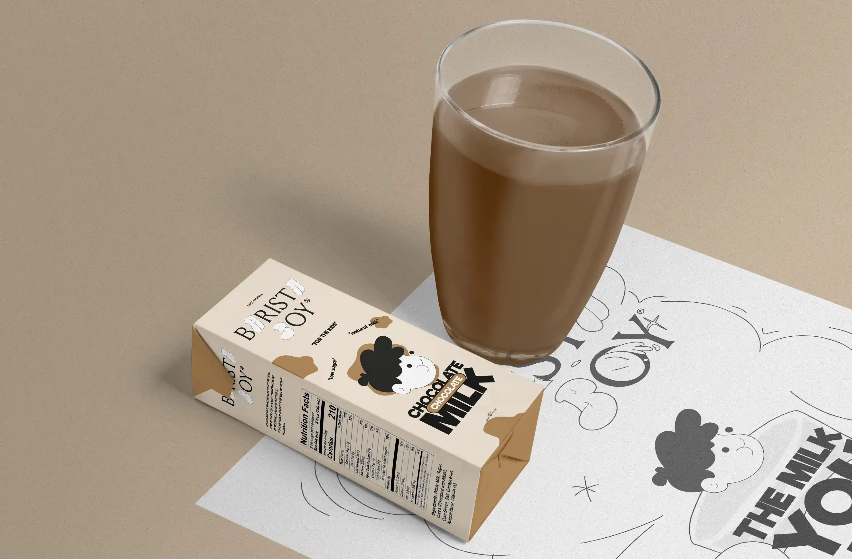
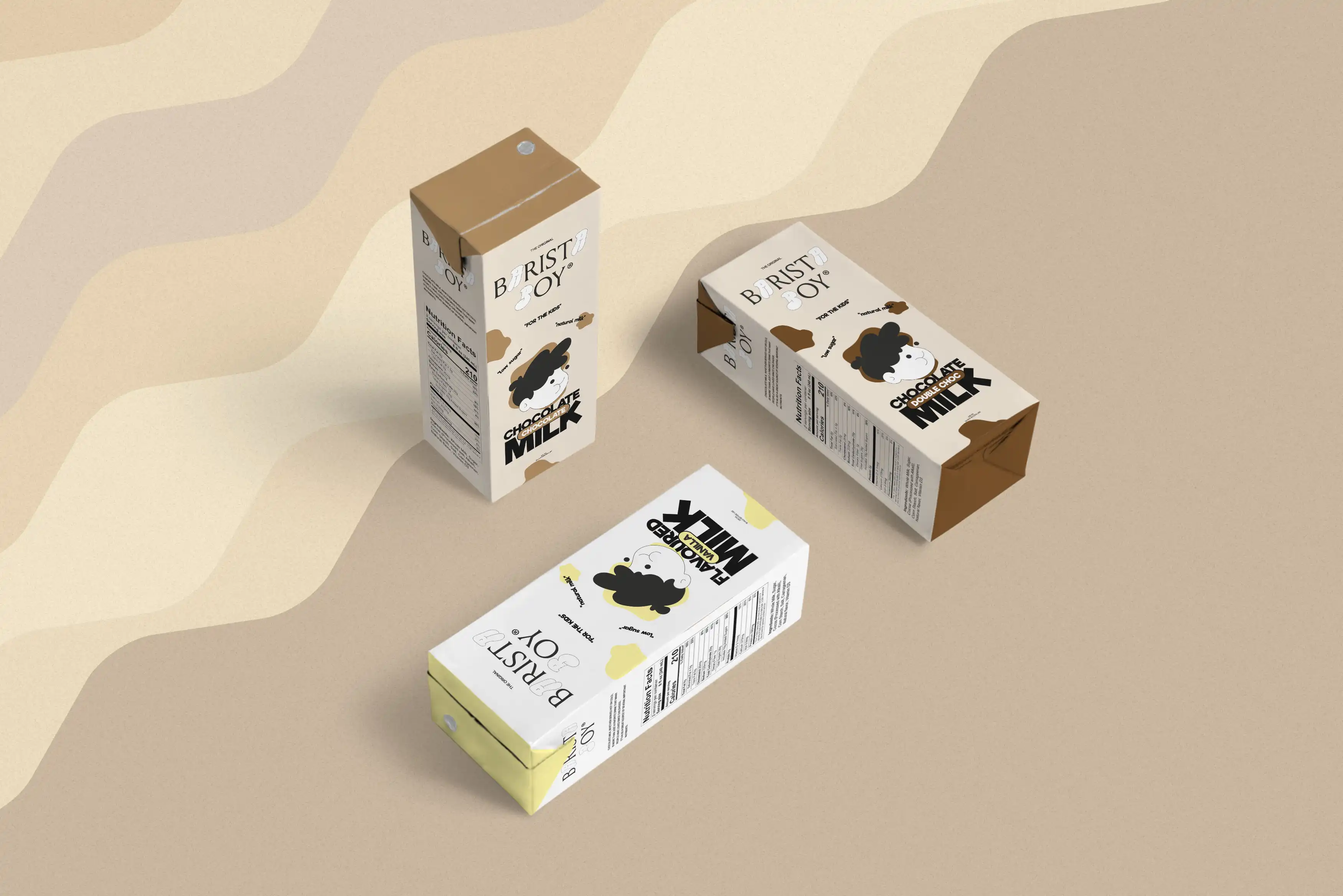
a hot chocolate, or even vanille / chocolate milk for the kids. THE baristas will carefully customize the drink to suit the client unique preferences.
The source of their premium coffee beans are from sustainable and ethical growers,
ensuring that each sip not only delights the taste buds but also supports a socially responsible cause.
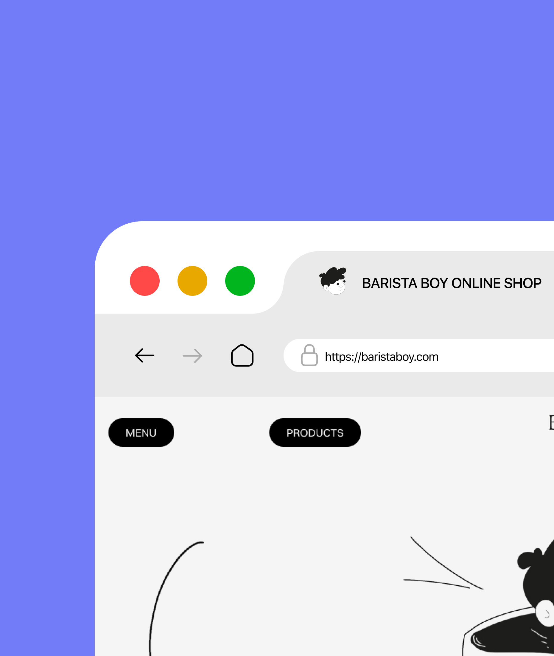
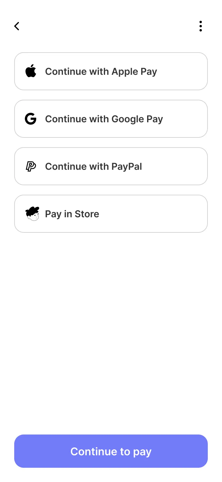
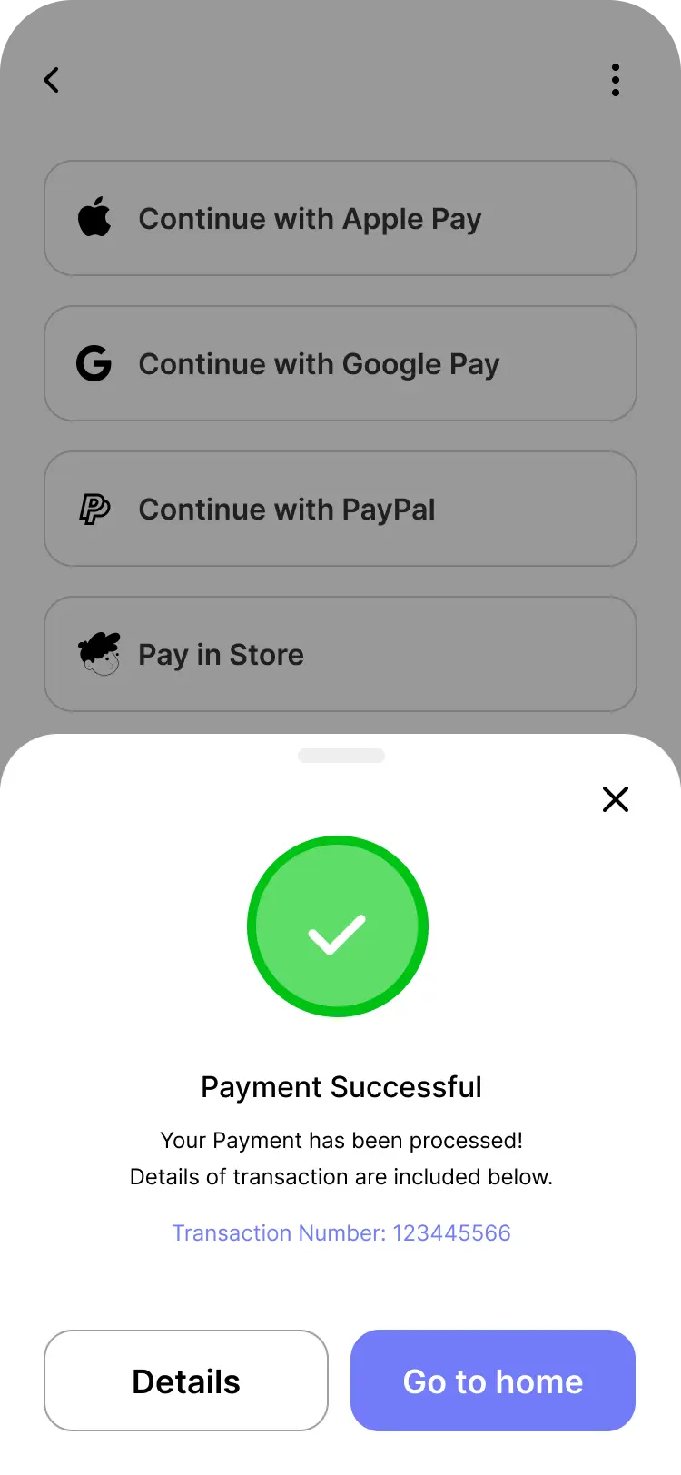
In addition to their in-house cafe experience, they also offers a convenient and seamless online ordering platform.
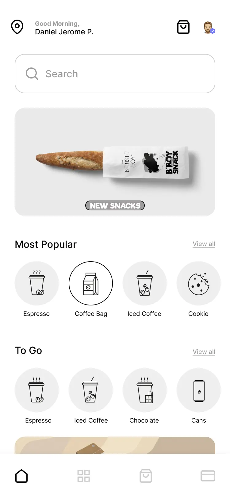
Whether you're on a tight schedule or simply prefer the comfort of enjoying their favorite coffee at home. Also the intuitive app allows you to order ahead,
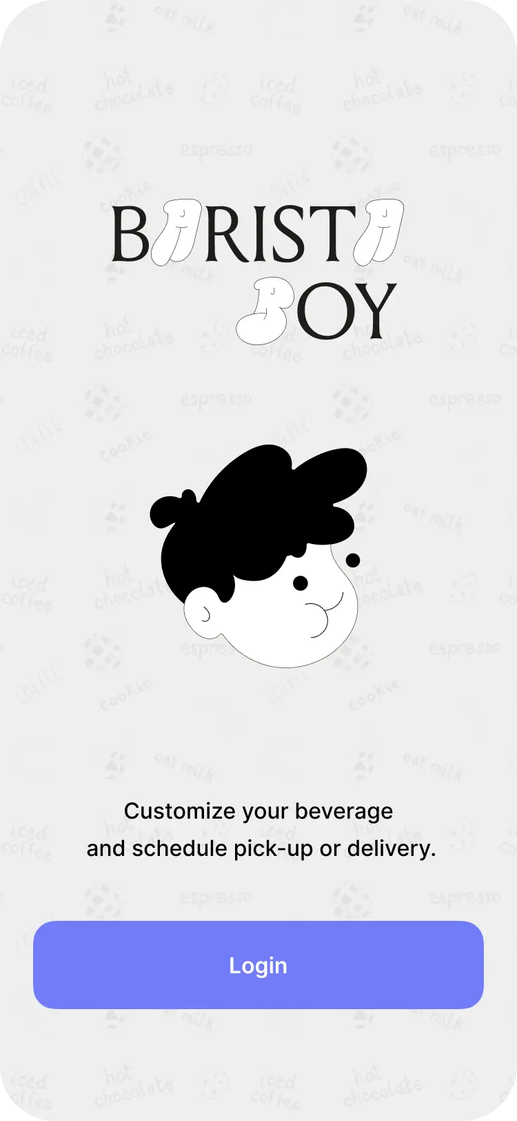
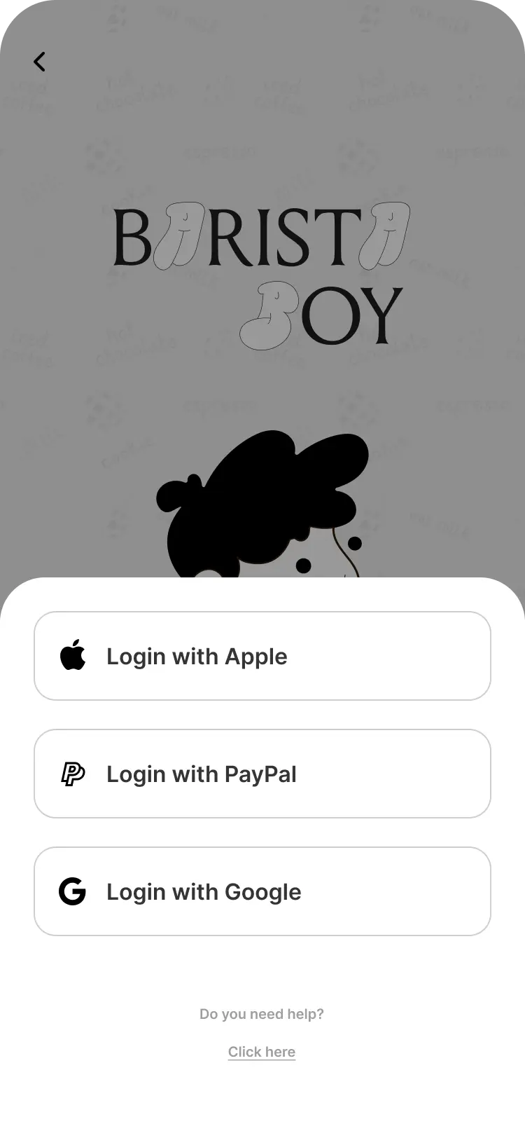
customize your beverage, and schedule pick-up or delivery.
⬤ Logo Design
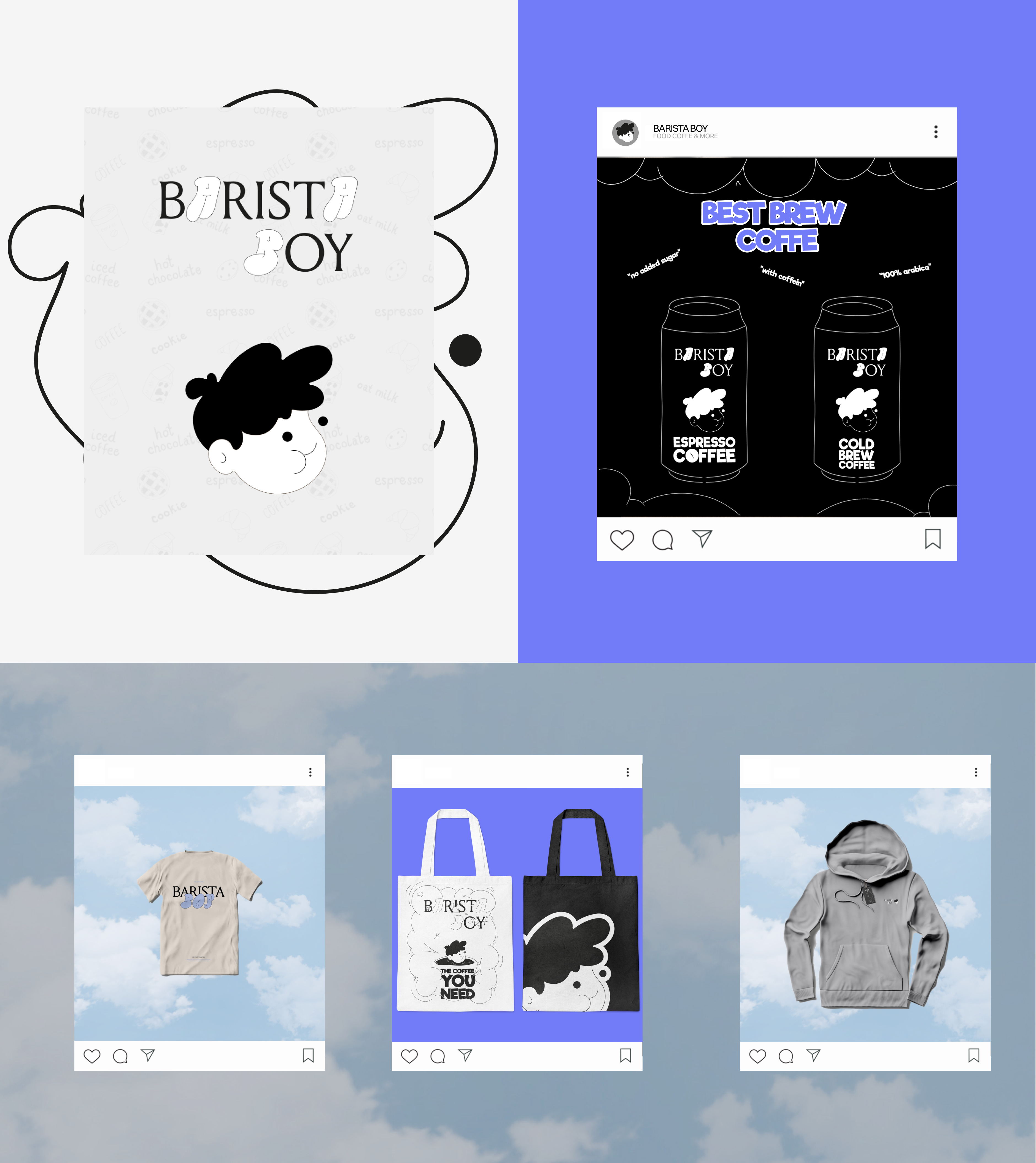
That Logo is pretty special. My thoughs for a stylish and vibrant barista cafe brand identity is,
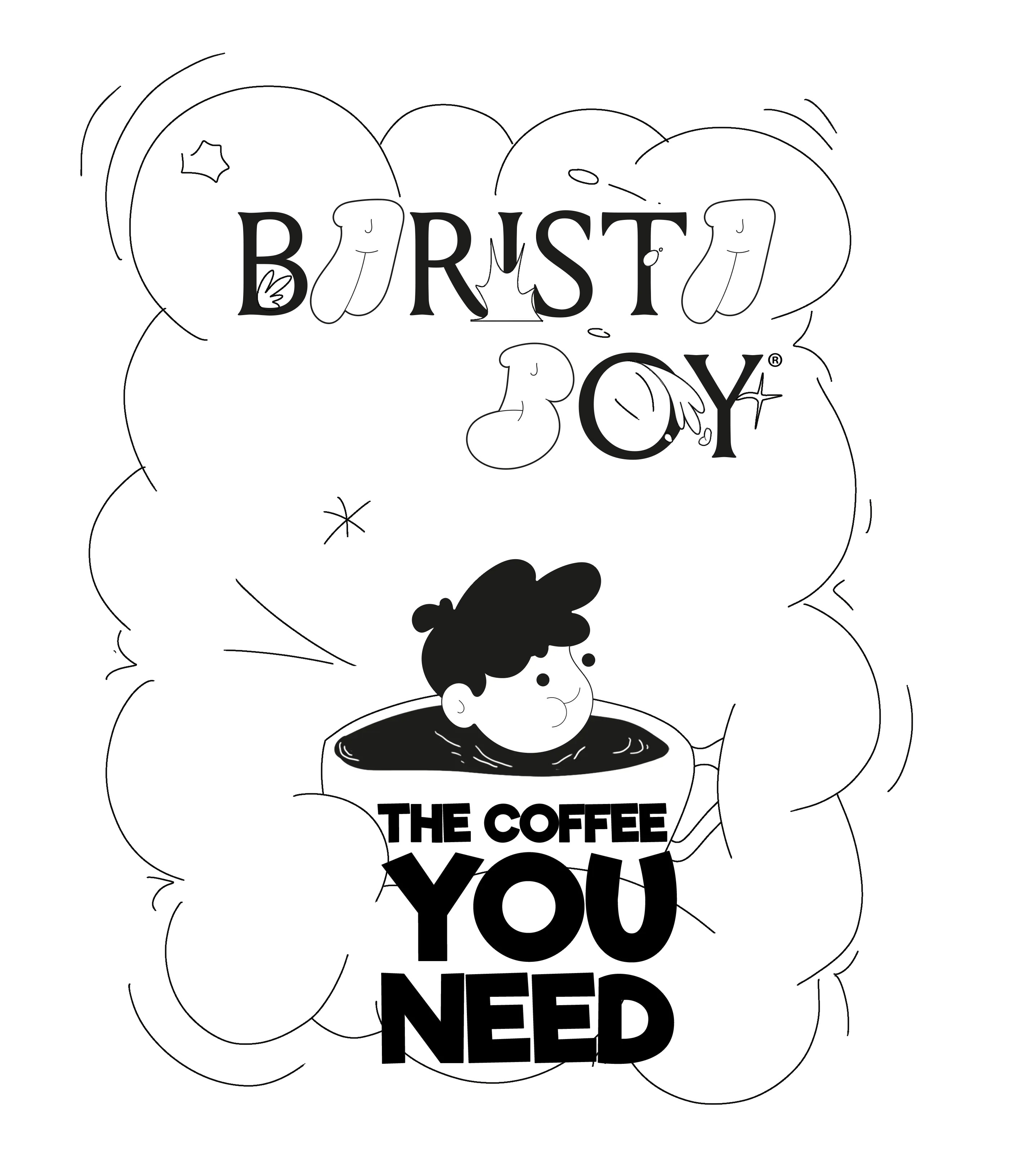
i opted for an eye-catching combination of a bubble playfull font along with a classic serif font.
The bubble font representing the energetic and creative atmosphere of the brand and is handmade.
Its playful curves and bold strokes convey a sense of fun and charisma,
capturing the attention of passersby and enticing them to stop and engage with the product or cafe itself.
I incorporated a timeless serif font for a touch of elegance and sophistication. The intricate details and slight
contrast in the serif letters add a touch of refinement to the brand identity,
highlighting the barista cafe's commitment to delivering premium quality coffee and beverages.
This harmonious fusion of the bubble graffiti and serif fonts creates a visually striking and distinctive brand identity.
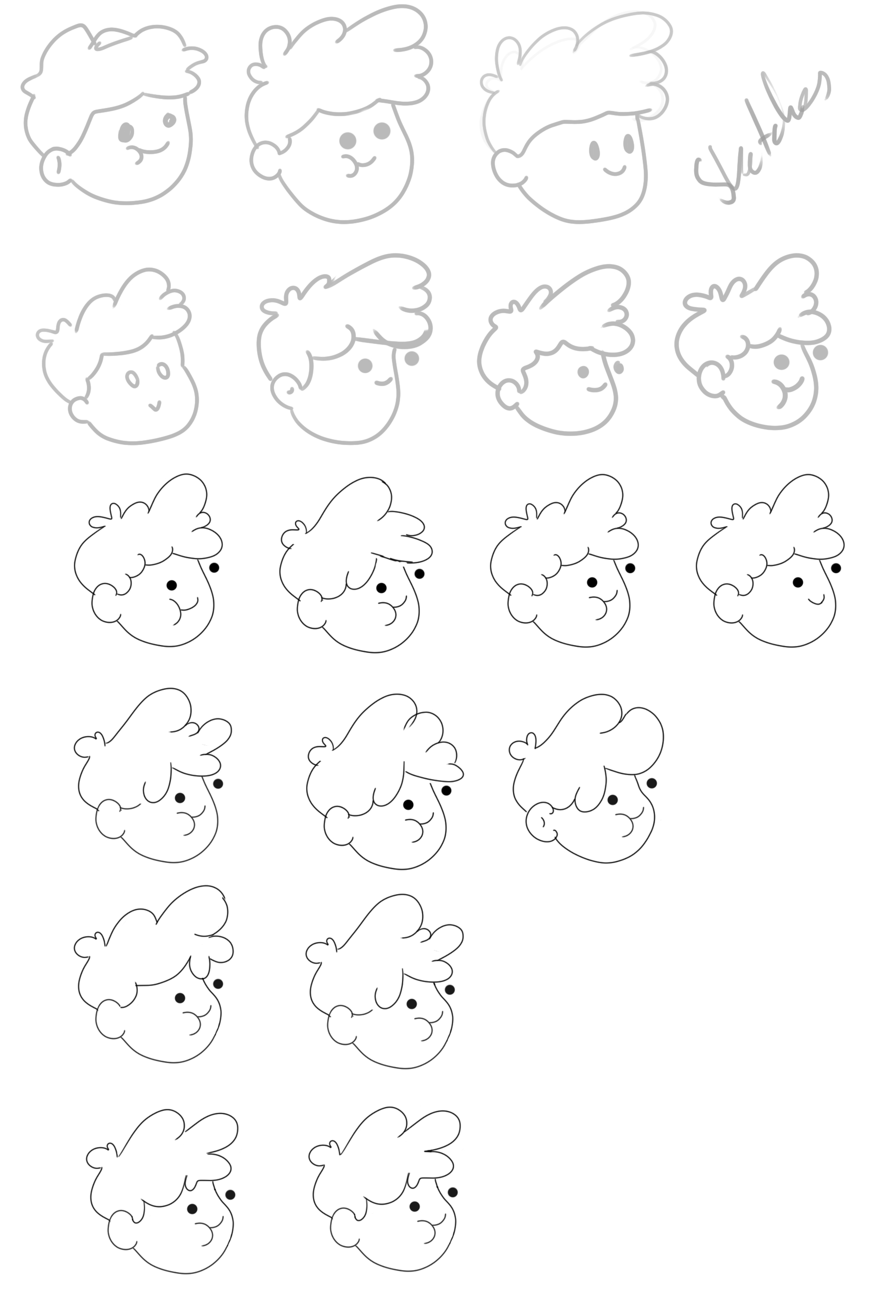
For the Logo itself i drew a Boy wich is inspired by the retro vintage characters with a mix of today minimalism.
It is the "FACE" for this brand & products.
⬤ Logo Design Process & Skatches
⬤ Typeface & Colors


#b6b6b8
#727cf9
#cebca5
#af8655
#683c11
#3d322d
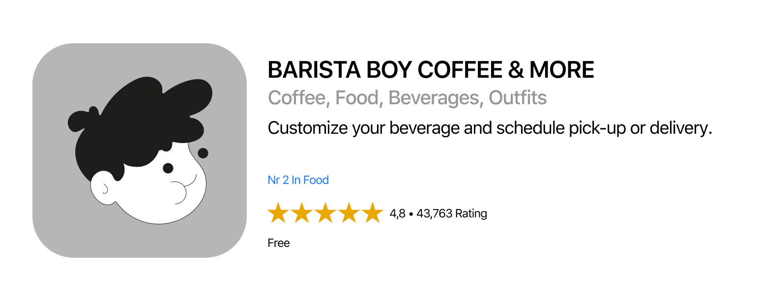
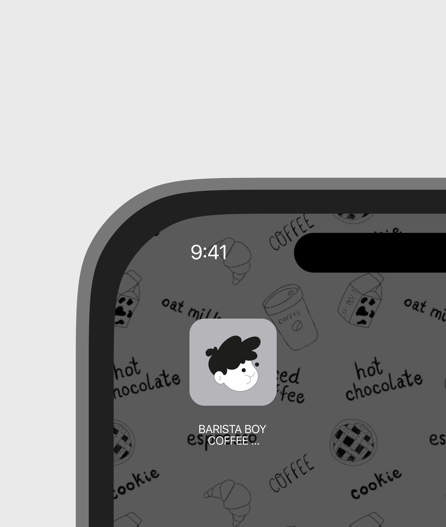
⬤ APP ICONS
⬤ Appdesign
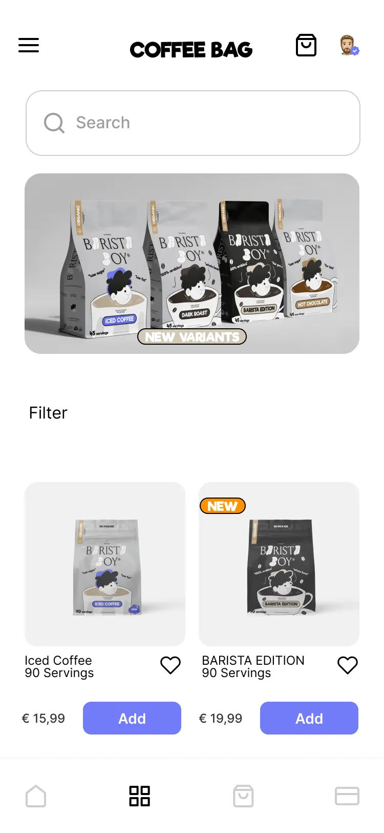
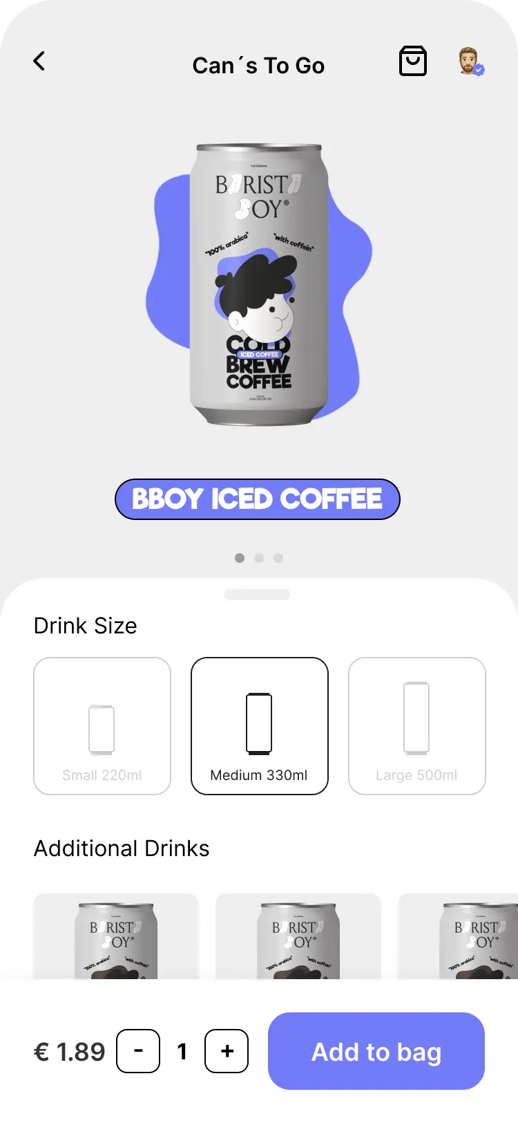
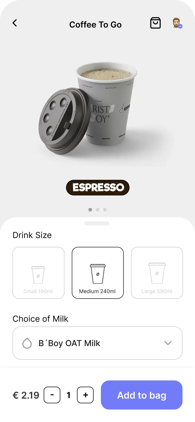
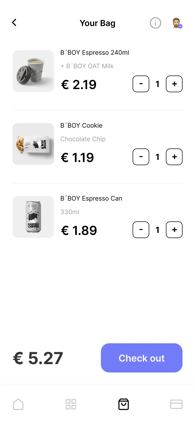
⬤ Branding & Visual Identity
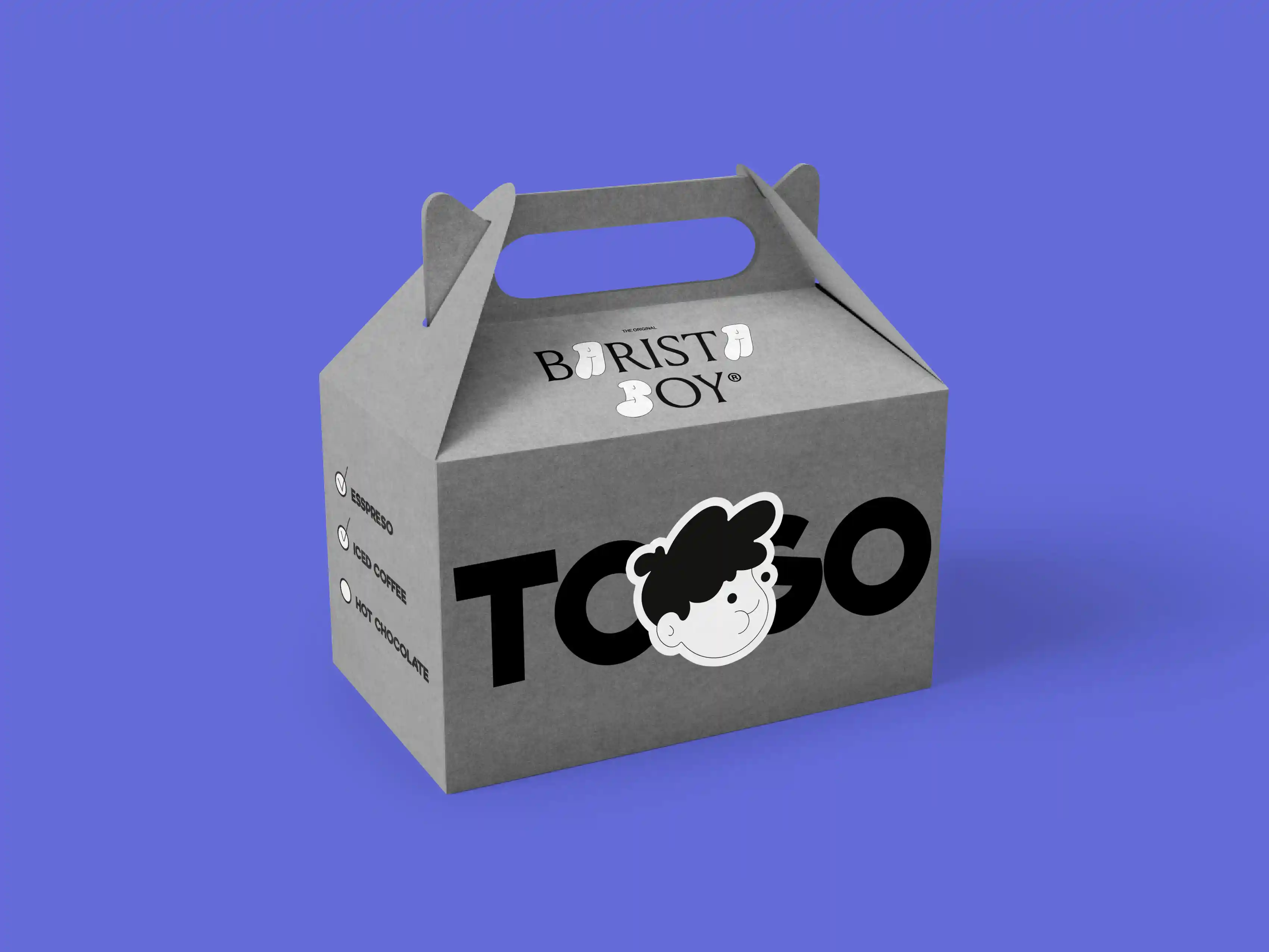
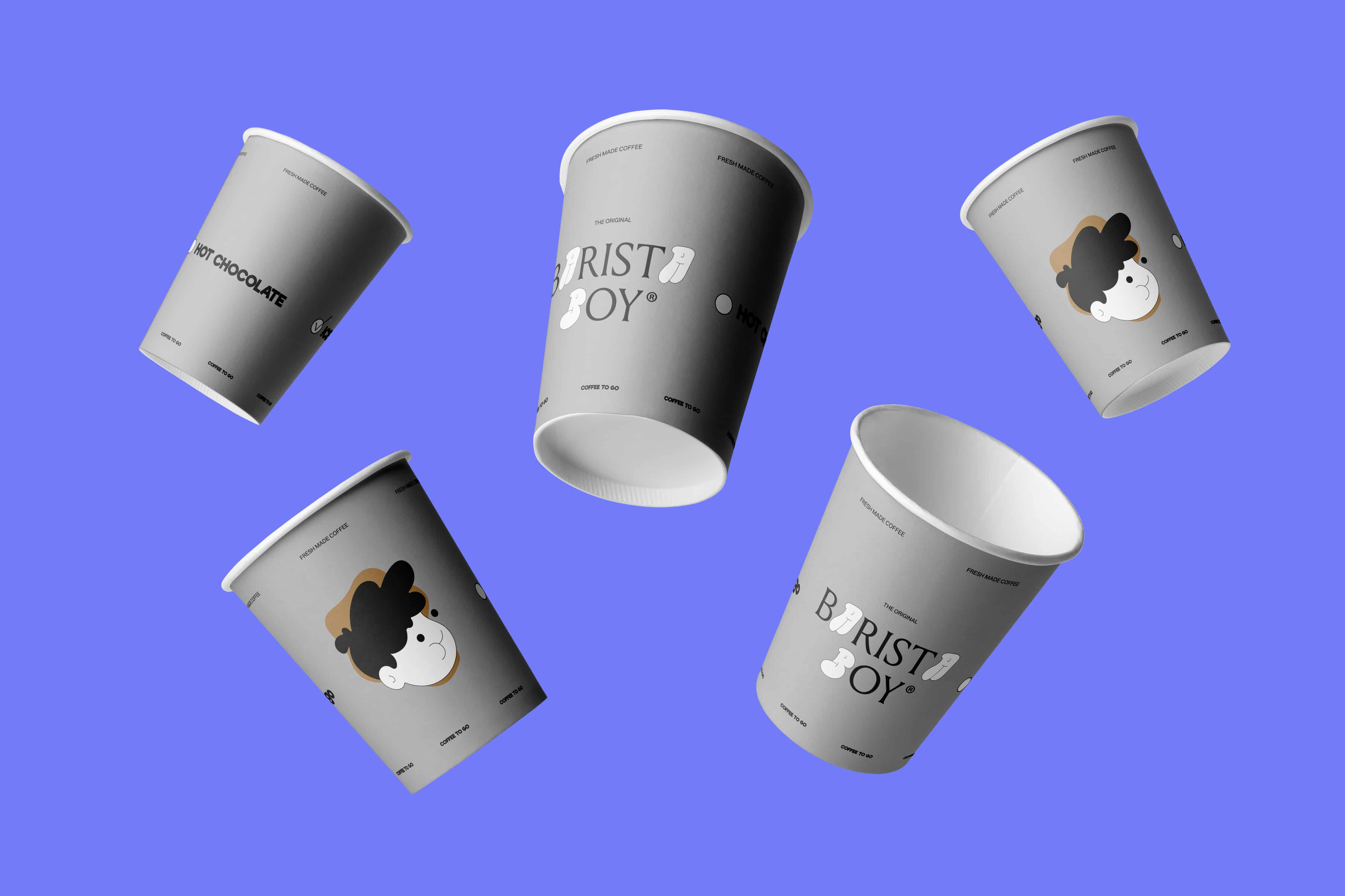
Product Design & Packaging
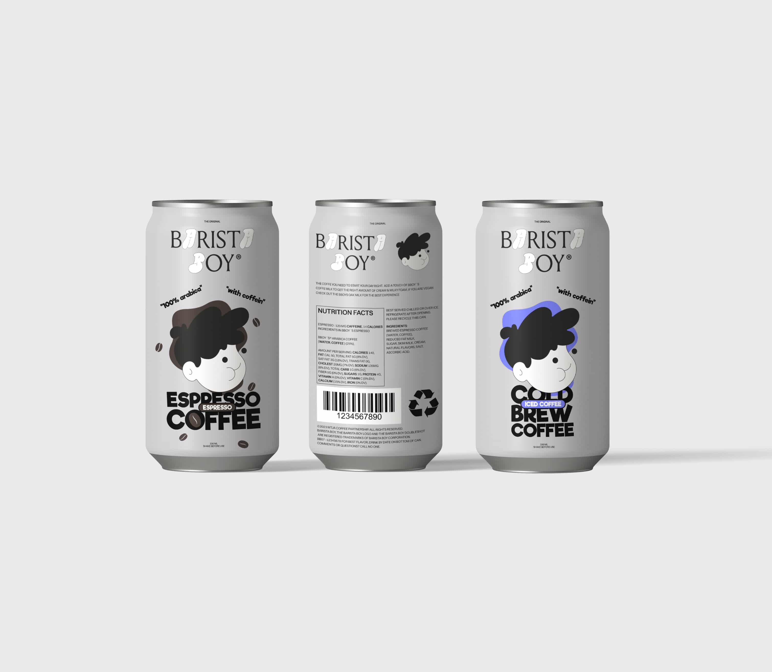
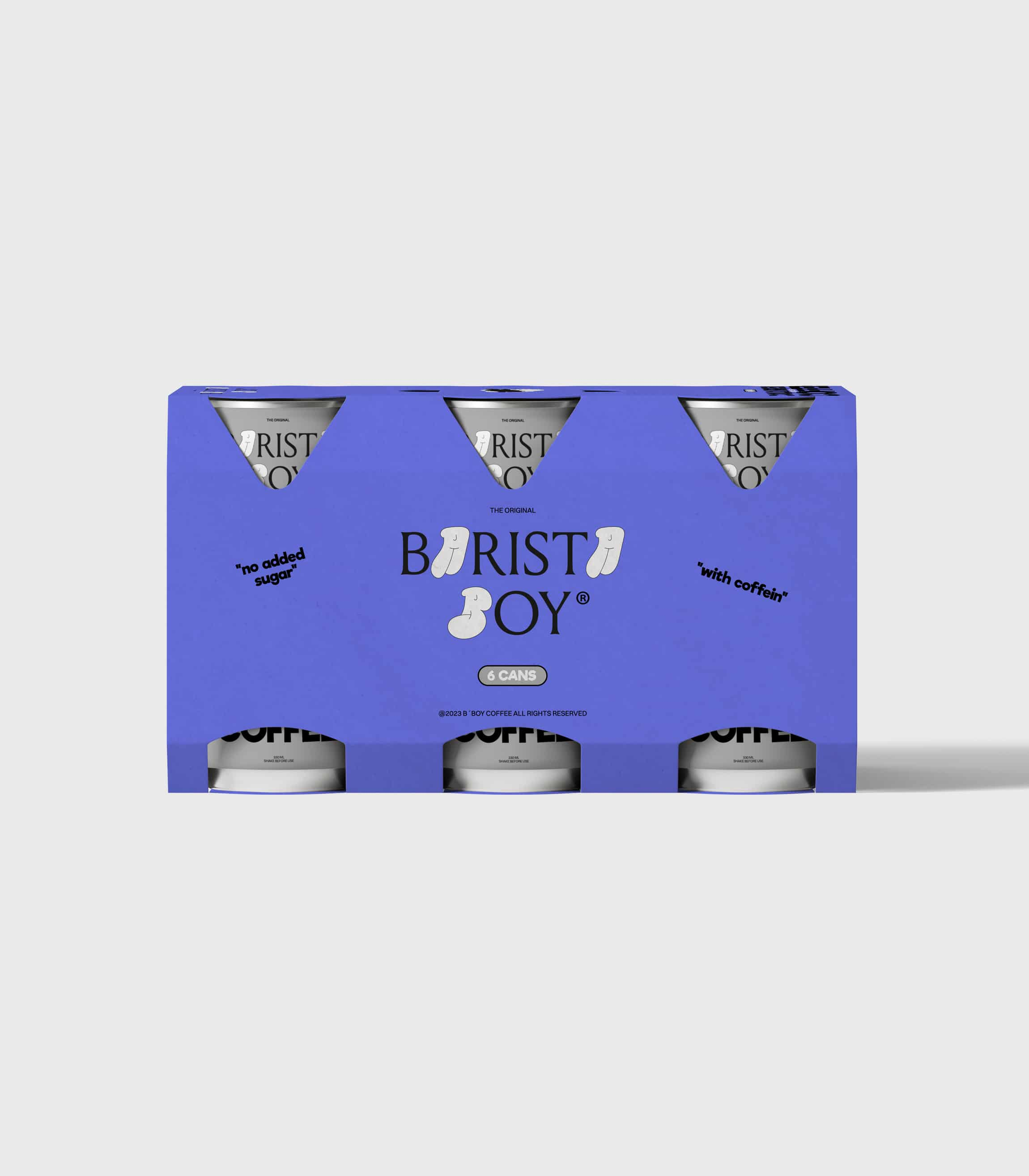
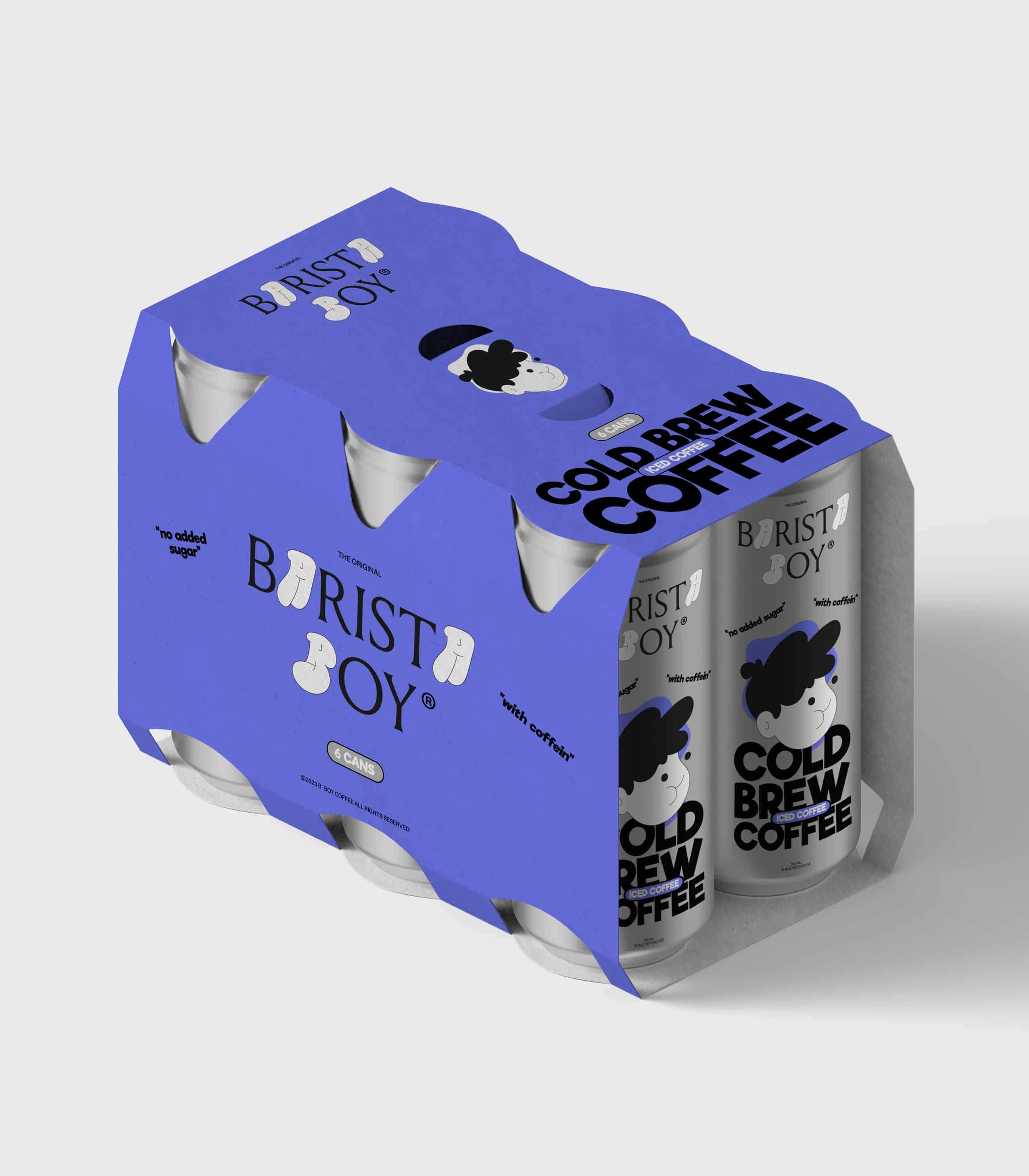
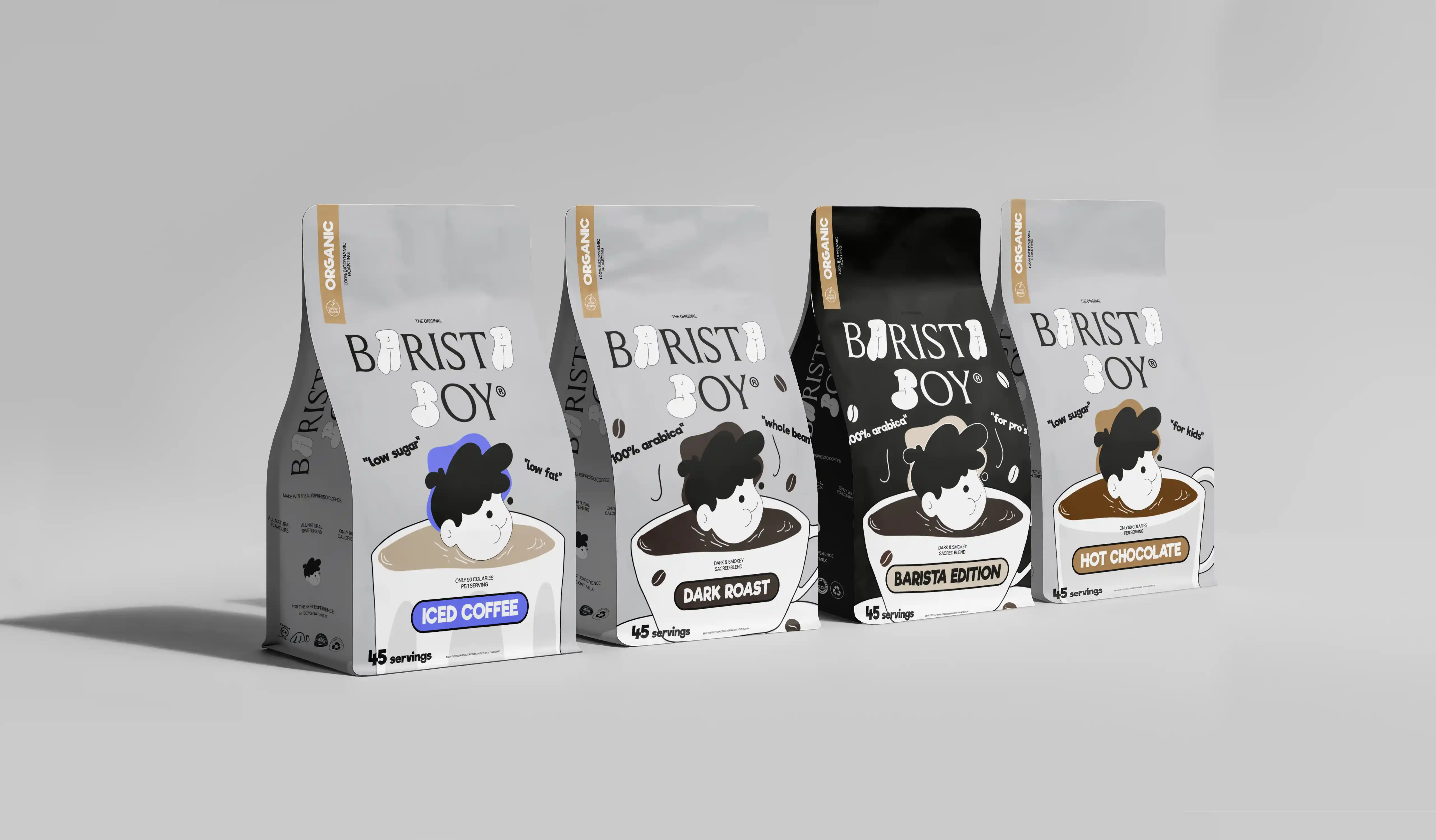
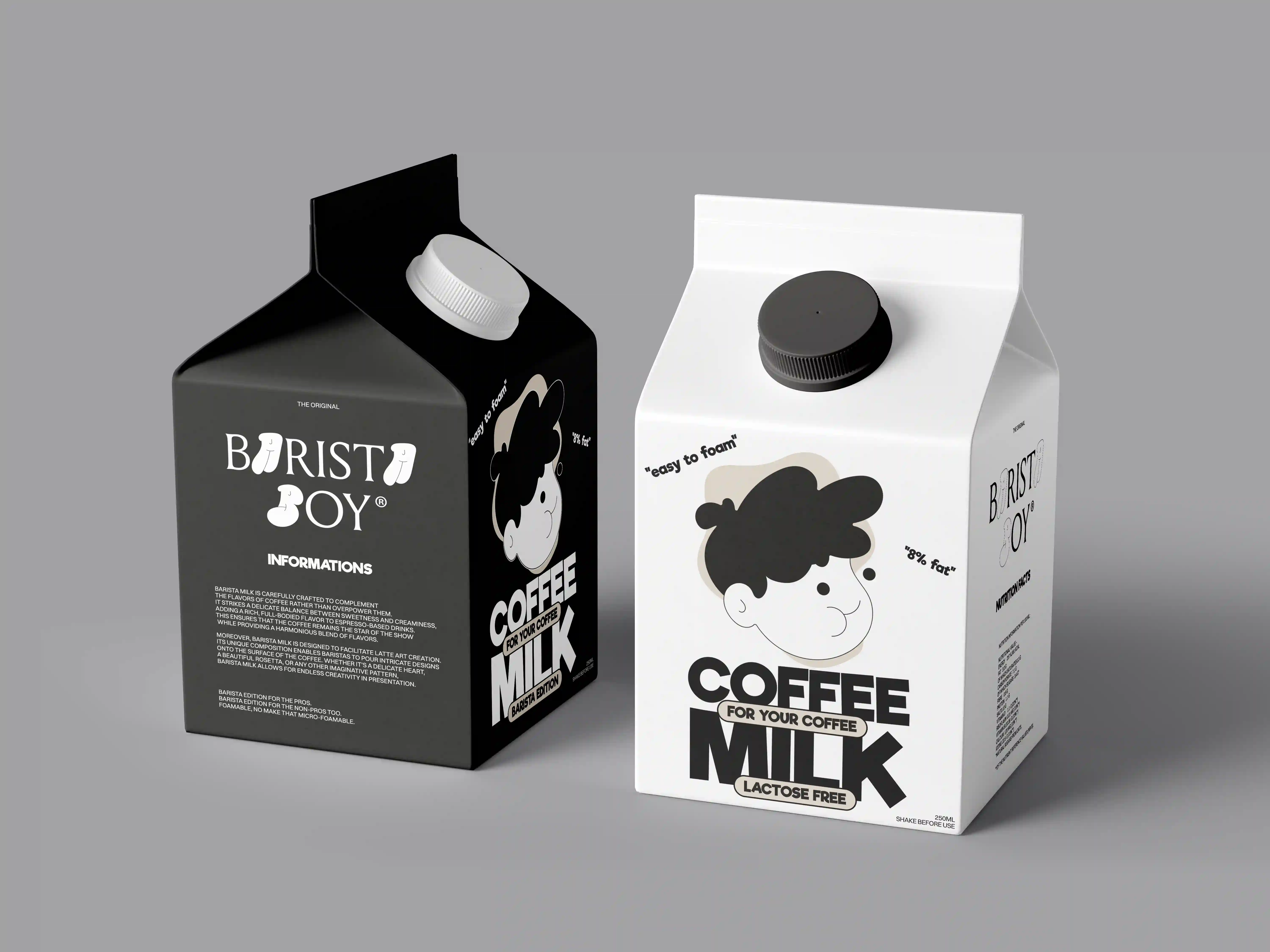
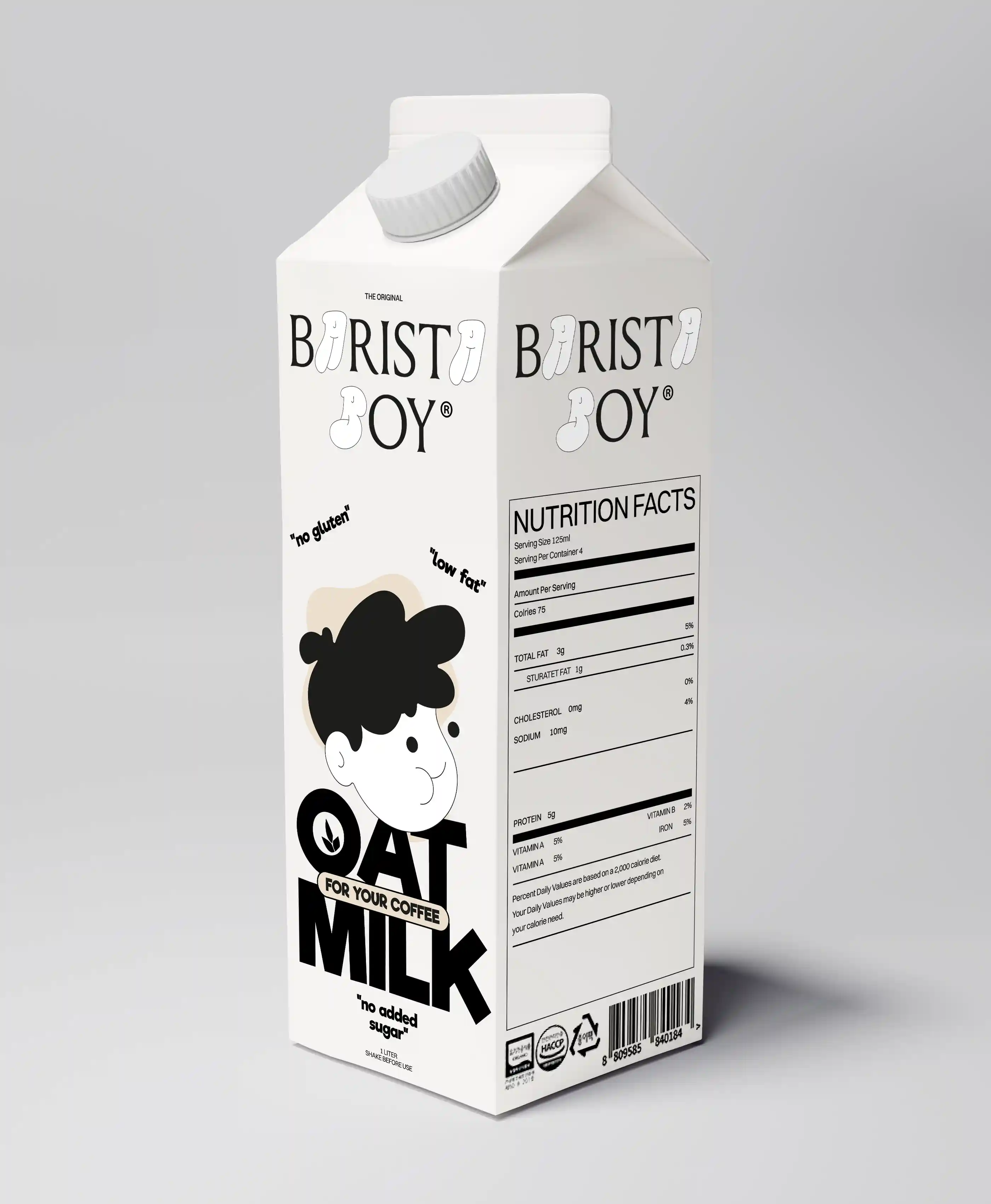
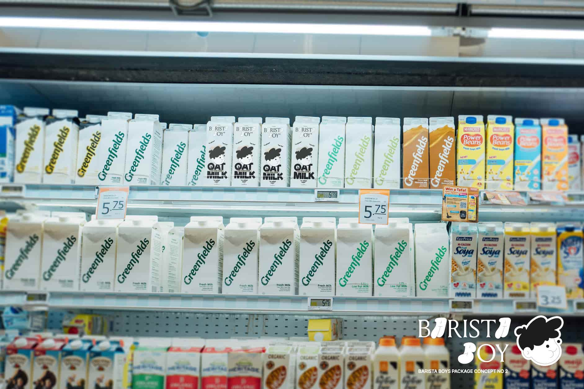
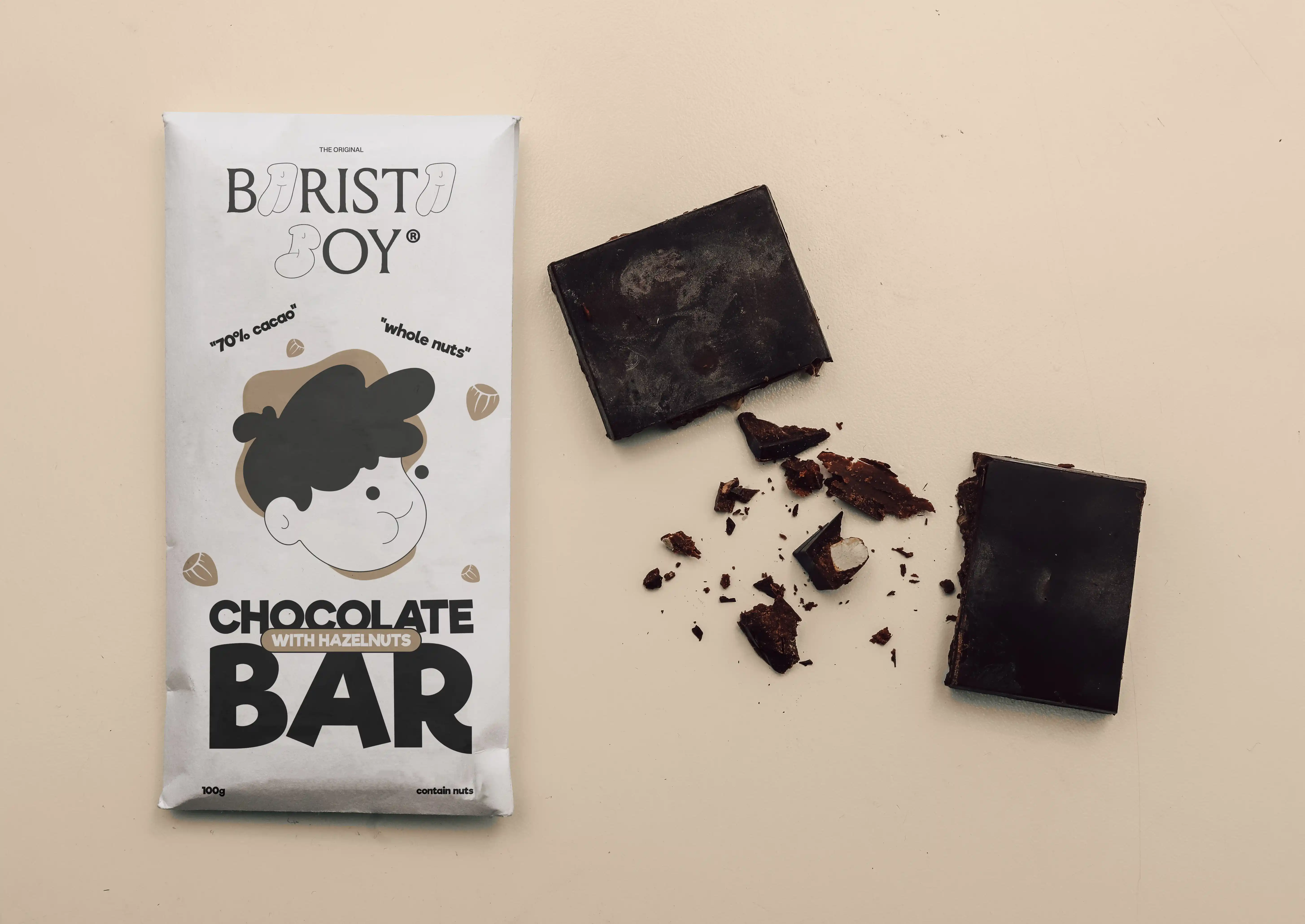
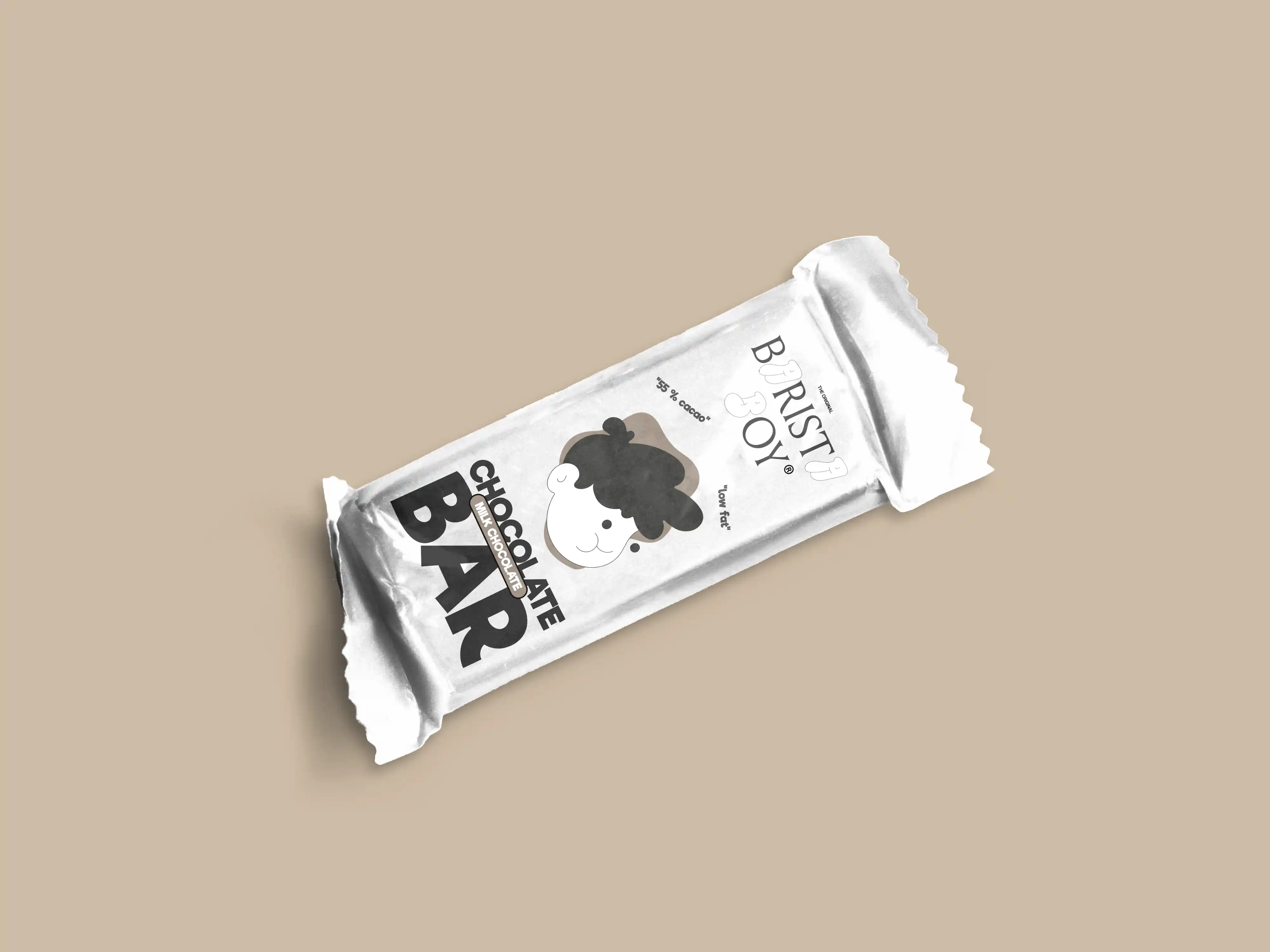
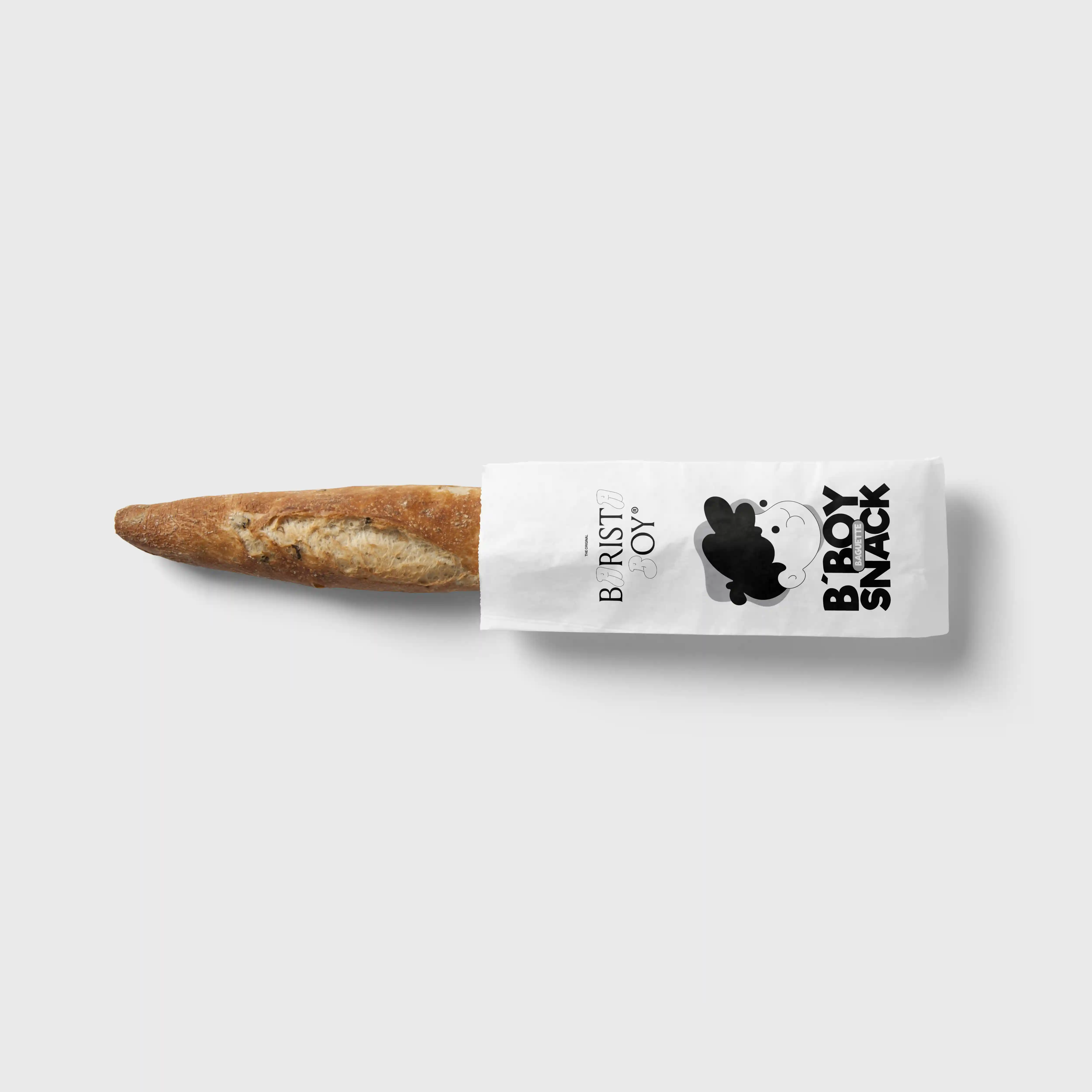
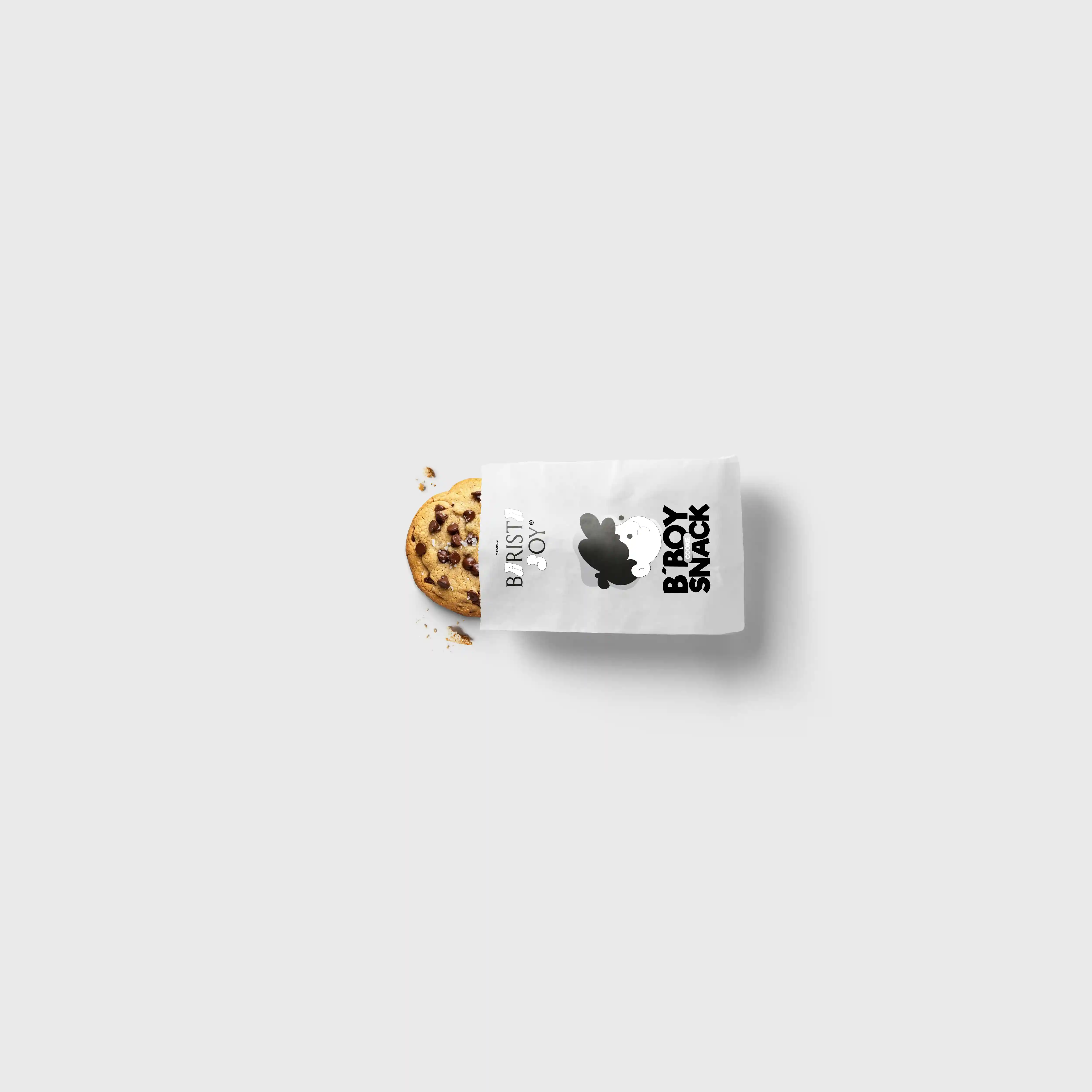
I aimed for a minimalstic, playfull & modern asthetic. To make the product stand out better, (in the shelf)
I placed the face in the middle and large, a good example is down below. A "splash" was placed in the background
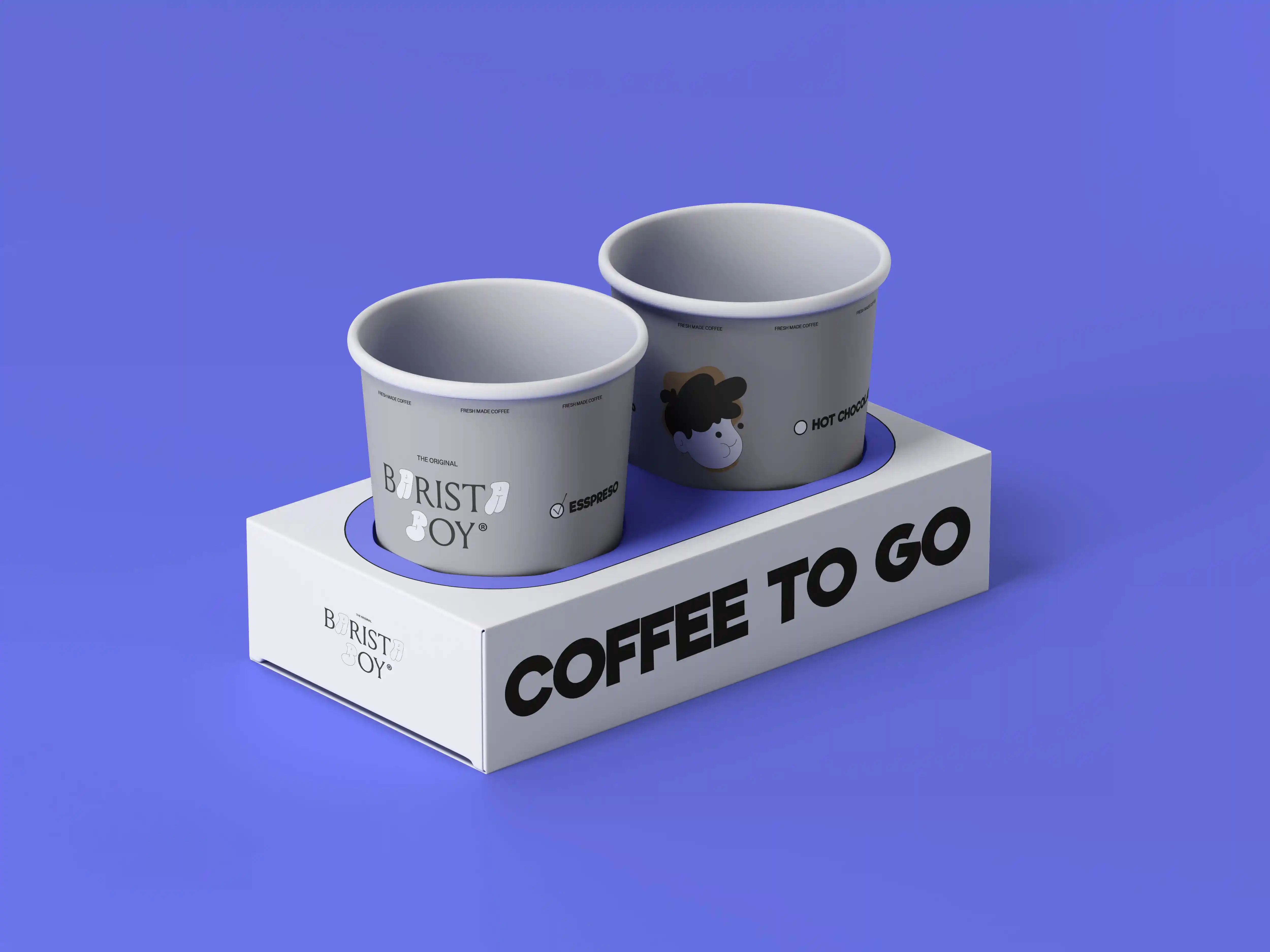
to make it easier to distinguishwhether it is an espresso (brown),
iced coffee (blue) or what flavor the children’s milk is intended for.
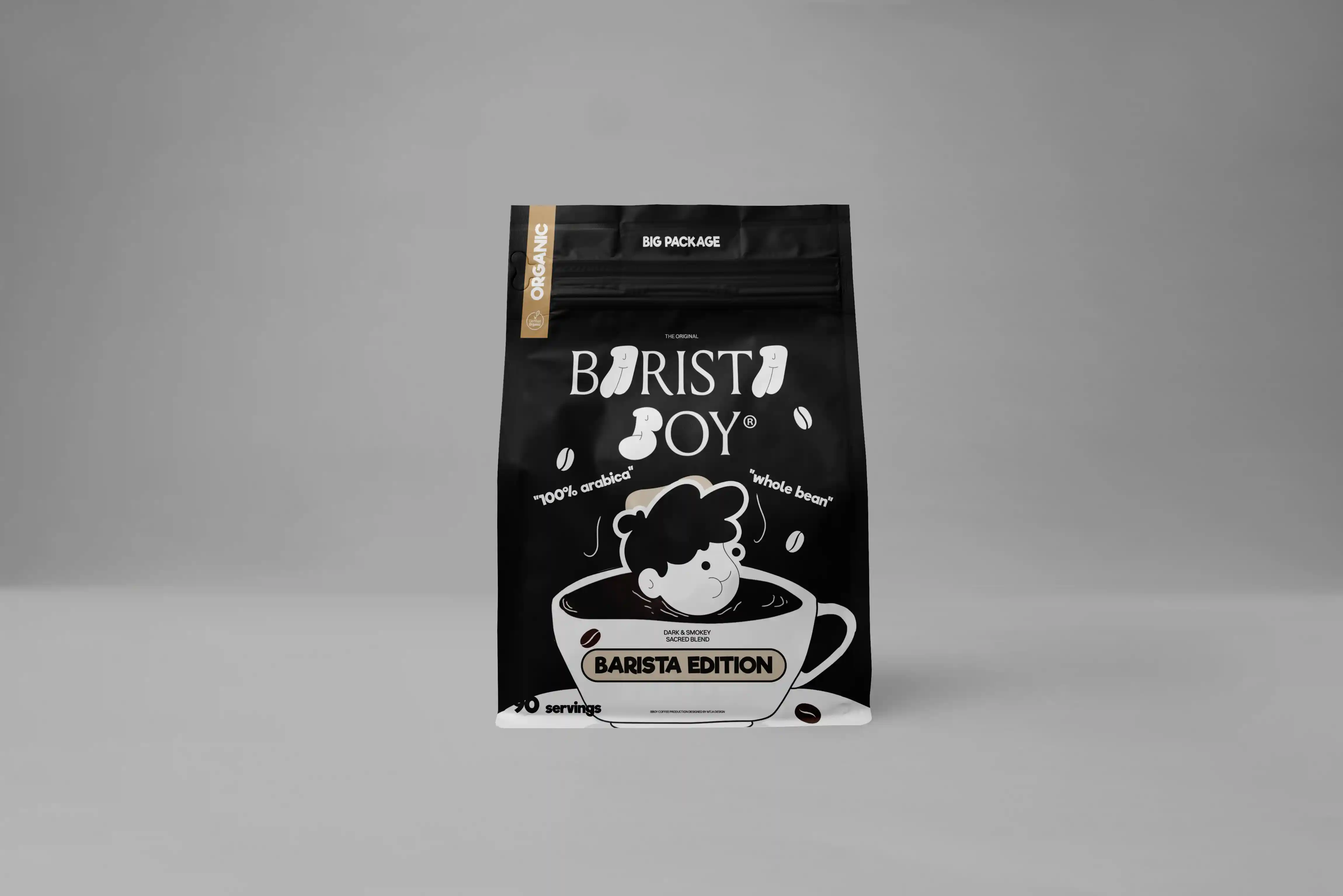
For the premium products i chosed "black" as the primary color, wich should emphesize "quality & professionalism".
It also increase the confidence of the product itself.
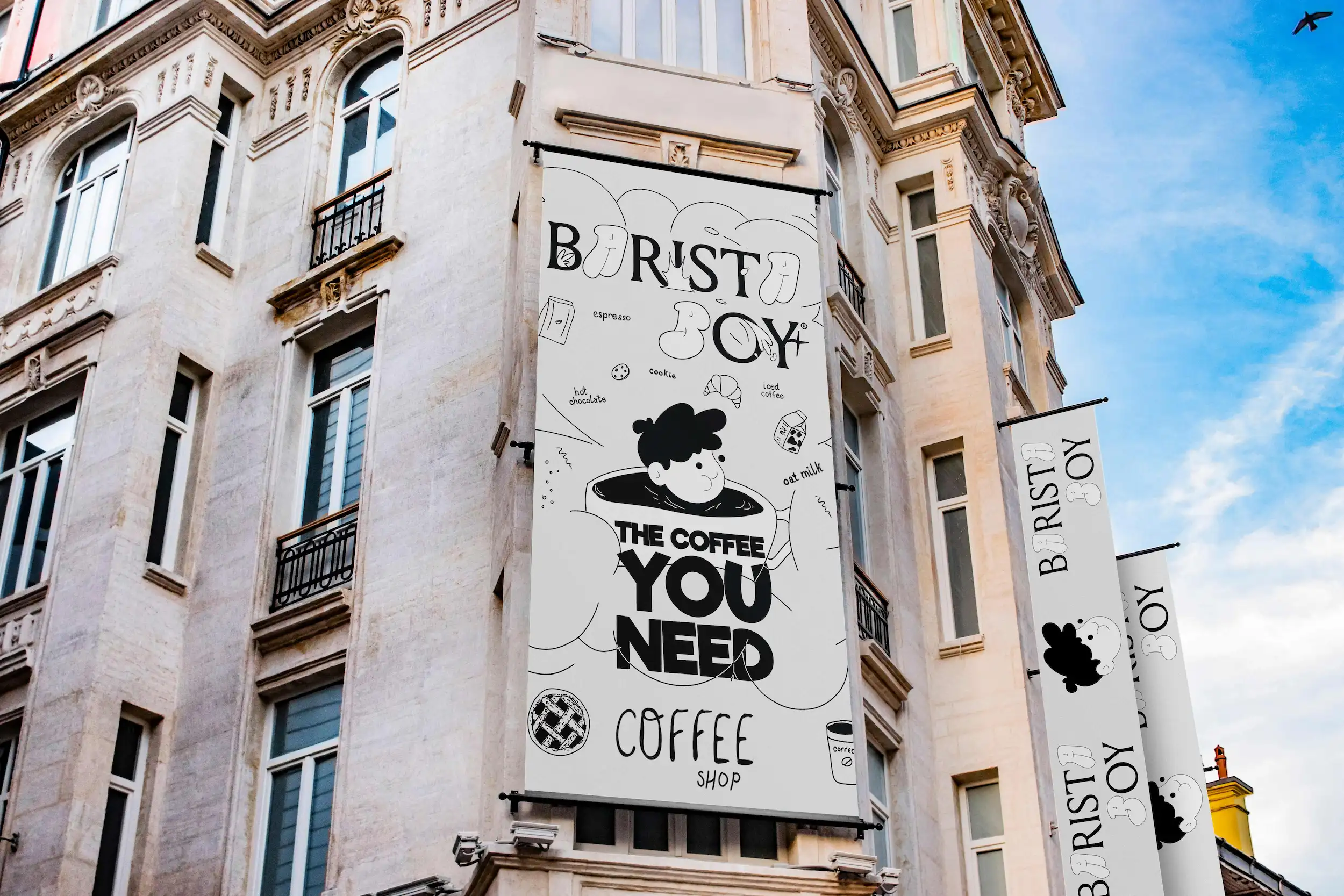
Billboard
Packaging presentation
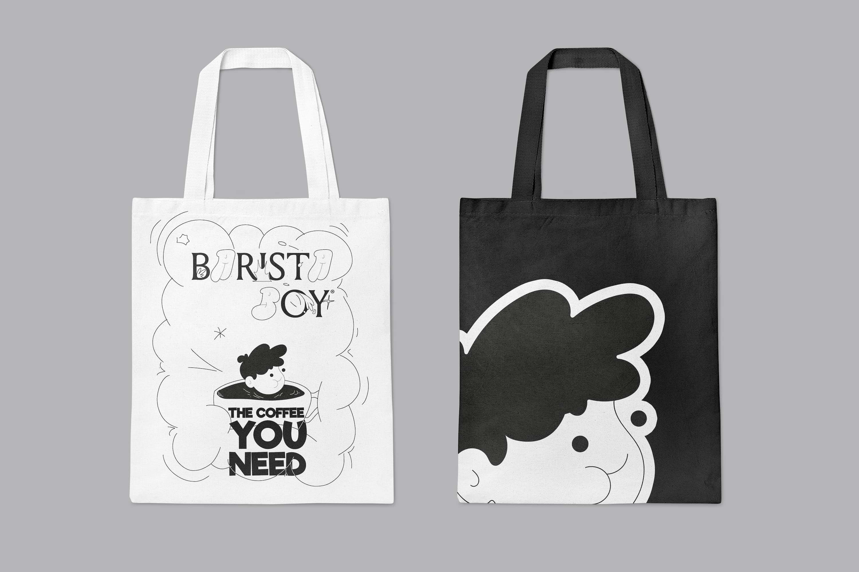
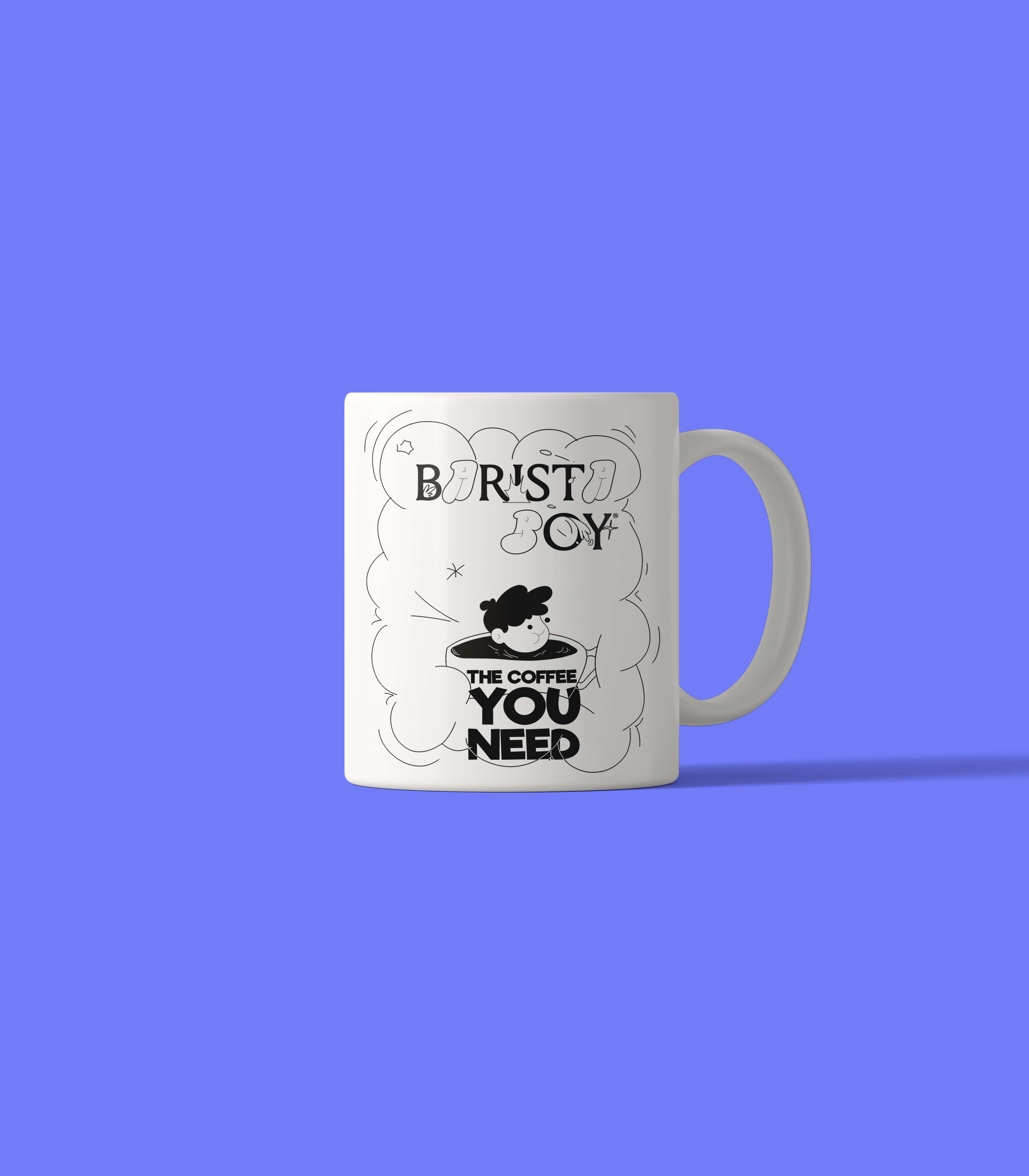
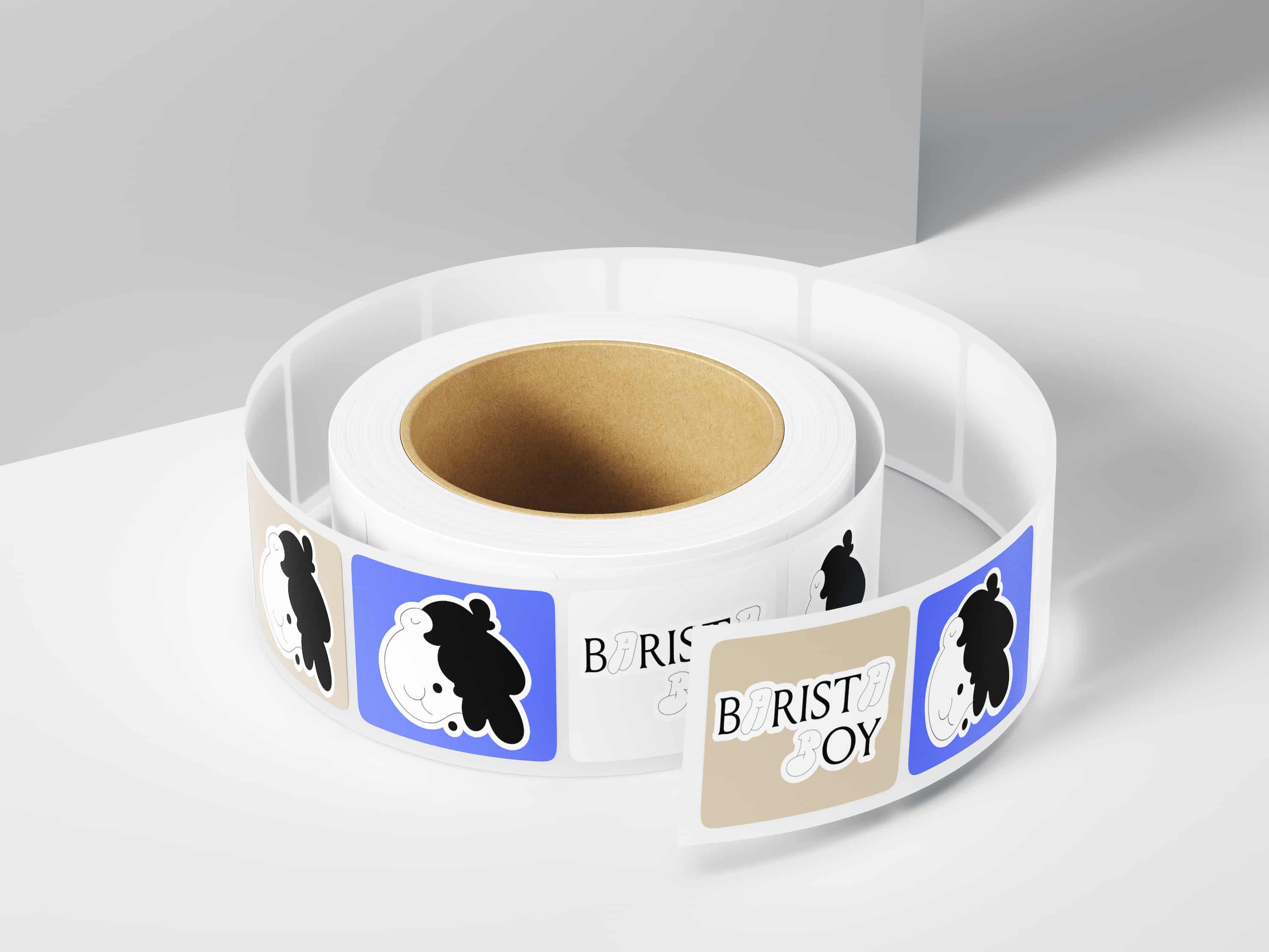
Merch for the Online Store



 >
>